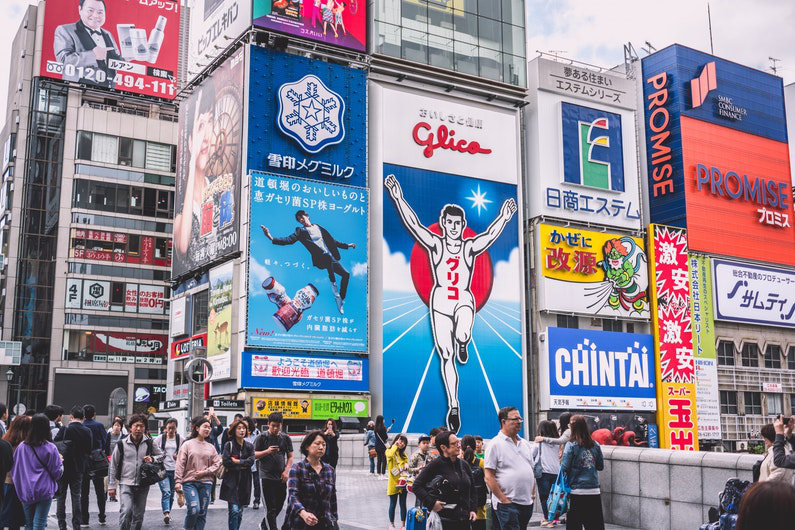
Advertising is all about getting the attention of your audience and encouraging them to check out your company. If you want to be noticed, you need to be in your audience’s line of sight. And how better to do that than with a massive billboard?
They’ve been used since the mid-1830s, originating in the streets of New York. Now, they’re used all around the world, and have even enjoyed a silver screen moment in Three Billboards Outside Ebbing, Missouri.
Thinking of investing in a billboard for your company? Read on to explore the benefits.

Billboard boosts
Brits are out on errands and other ventures for around three hours and ten minute every day, and they look at adverts for around 16 minutes, according to Route. Why not target your consumer during this window of opportunity with a large, quality, well-located billboard in a place with high footfall or traffic?
Billboards are easy to design and print too — no making multiple pages like for brochures. Need something effective up and running in a hurry? A billboard is a single page of design, which should save you time when putting together a template that will offer maximum ROI.
Do you know the ‘Marketing Rule of 7’? This theory claims that a consumer must hear or see an advertising message at least seven times before taking action. By placing an outdoor banner in a public place where people will pass every day or a few times a day — like on the way to work or when dropping off and picking up their kids from school — you can help hit this number and potentially increase your brand’s chances of a conversion.
Billboards are certainly a powerful way to reach a bigger audience every day. So, how do you make sure your billboards are as effective as possible?
Putting together a great billboard
It’s crucial that your ad is eye-catching. However, if your billboard will be placed at the side of a high-speed road, this creates an even greater demand for noticeability. Think strategically about what you want on your billboard — someone driving past at 40mph+ is only going to be able to take in so much. What is your marketing objective? Do you want to sell a specific product? Are you spreading brand awareness? Promoting an event? Determine exactly what you want to achieve from your advertisement and provide only the essential information — like contact number, name of product or date and location of event.

Use a large image
Billboards obviously lend themselves well to a large image. According to research, people generally only recall 10% of information they hear three days later. However, using a relevant image alongside this information increases retention by 55%. When designing your billboard, try and think of a funny or quirky image that will grab and hold a passer-by’s attention — such as cake brand, Mr Kipling’s, clever and unusual image of a bunny made using only Cherry Bakewell cakes as part of its Easter marketing campaign. Due to the size of a billboard, your images can pack a more powerful punch, so focus on getting the image perfect and then build your design from there.
Keep it all clear when it comes to your billboard design. Utilise bright and bold colours to catch the eye — contrasting colours are reportedly stay in people’s memories for longer, too — and opt for a simple background and large, readable text — Sans Serif is a good shout.
Keep copy minimal
Is your billboard going to be located at a roadside? A driver typically has five to ten seconds to view an ad, which means you need to consider copy length. The more relevant and informative your image is, the less you should need to convey with text — stick to a brief, punchy message of seven words and you should get your marketing message across, no problem.
Location, location, location
Location is an important factor to consider when planning for your audience. For example, if your products are for 18-21-years-olds, find a site near a university or college. Otherwise, you could reduce your ROI due to not being in sight of the people who are most likely to engage and act on your ad.
Go local
When placing a billboard locally, show your involvement with the community by making reference to something local. Include an image of a local landmark to create a sense of familiarity or reference the local traffic in a funny way. Humour generally works in advertising. According to a review of 6,500 ads, the funniest were usually cited as being the most appealing and memorable. What’s more, adopting this personal and familiar approach creates a sense of friendliness, so you’ll also exude a more welcoming brand persona — which will be more encouraging to a potential customer.
Start increasing your sales and customer base with billboard advertising today!
This article was researched and created by Where The Trade Buys, retailer of selfie frames for businesses.


