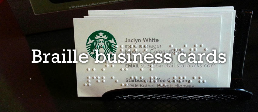
Networking is important for all business people, including those who are blind. One way to make your business card get noticed and make a profound statement supporting diversity is to simply add braille.

What Is Braille, and Why Should It Be on a Business Card?
Braille is a form of written language for the blind that consists of raised dots that are “read” by being felt by the fingertips. Louis Braille, a Frenchman who became blind at the age of three, created the system when he was a teenager. A full braille cell contains six raised dots arranged in two parallel rows, each row consisting of three dots. Sixty-four combinations are possible by using one or more of these dots, and a single cell can represent a letter of the alphabet, punctuation mark, number, or an entire word.
According to the National Braille Press, blind people who know braille achieve higher academic success and greater employment opportunities. One of the major ways for both sighted and blind people to secure employment is through networking, so it is important that the information contained on business cards can be read by those who can see and those who cannot.
Challenges and Guidelines
According to the Braille Authority of North America (BANA), the main challenge of brailling business cards is the small surface on which to place the braille. Most business cards measure about two inches by three-and-a-half inches in size and can typically accommodate about four lines of braille with 14 cells each.
One strategy to overcome the space issue is to use the fold-over style of business card that basically doubles the writing surface of the card. However, most business cards usually contain far more print than will fit in braille, no matter how the space is used. For this reason, figuring out what information to braille is extremely important.
Deciding What to Braille
Basic business cards contain a name, job title, organization or company, mailing address, phone, fax, cell phone, email address, and website. But there will not be room to braille all this information on a typical business card, so thought must be given to the crucial elements that will be embossed in braille on a maximum of four lines.
Brailling the person’s name is essential in most cases, but it must be kept to one 14-cell line, and certain strategies, such as removing capitals, middle initials, using an initial for the first name, and, as a last resort, continuing the name onto the second line, can be used.
Although the name of the organization or company should be brailled, if at all possible, it may be left off for space considerations, especially if the email address contains the name of the company or employer. An email address should be brailled according to the Computer Braille Code (CBC). When brailling a telephone number on a business card, adding a number sign and leaving off extra characters like parentheses will fit best: #123-456-7890, for example.

Other Benefits
For obvious reasons, blind people appreciate it when those that can see add braille to their business cards. Alan Brightman, senior policy director for special communities at Yahoo Inc., who has braille on his business card, was quoted in the Akron Beacon Journal as saying, “It almost always generates a 30-second to a five-minute conversation about why accessibility matters,” said Brightman, who is not blind. “For me, it’s designed to increase awareness.”
Brightman said the number of people using business cards embossed with braille is rising because more blind people are entering the workforce, and also because sighted business professionals are giving the cards to sighted clients as a way to encourage diversity and help make their business card stand out.
Cover photo credit: Kay Kay, Love Love


