Its common knowledge that the high street has struggled over the last year. Experts have confirmed this with a survey showing that more than 1,000 Australian are moving to digital shopping. But what can physical shops do in order to survive?
Visual merchandising is most prominent in the retail sector and can really have an effect on the way a customer purchases within the high street industry. However, there’s a skill to doing this effectively. To help, take a read through this handy guide for advice on executing a strong and competitive visual merchandising strategy.

The aim of visual merchandising
To put it simply, it’s when you rearrange a group of products in your store together, in an attempt to encourage customers to buy in larger quantities. Overall, the aim is to boost sales and profits for the company, as well as give the consumer a better in-store experience.
Being strategic about the way you arrange your store will affect how likely your customer are to buy products and how many. A strong visual display can raise revenue and even encourage customer loyalty.
Looking at the Fast-Moving Consumer Goods (FMCG) industry for example, there is the ideological shift towards a lot of rural areas choosing to purchase locally. This change in consumer purchase behaviour has prompted the need of many convenience stores to up their promotional efforts in order to generate in smaller towns.
Display similar products together
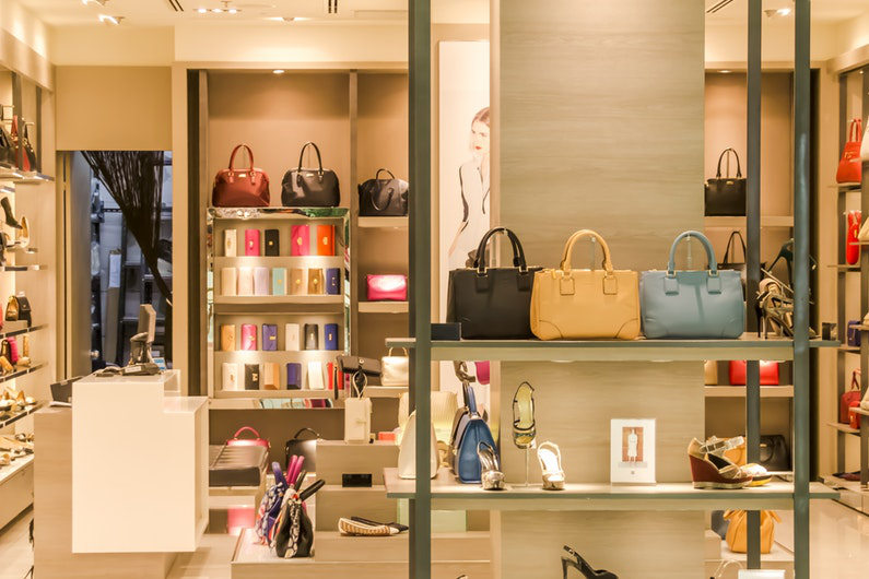
Placing products together that are naturally going to complement each other, will make for a better shopping experience and can help increase product sales. Showing off plenty of products is, of course, beneficial from your point of view as a vendor. But be careful not to make your displays look cluttered. Use a mix of racks and shelves to neatly display items and remember — a focal point boosts sales by a reported 229%, so ensure that you effectively direct your consumers when they enter your store using printed banners and other promotional products to highlight a section.
It can be useful to read up on the ‘Pyramid Principle’ or ‘Rule of Three’ methods. The Pyramid Principle revolves around triangular displays, with the biggest item in the middle and the smallest on the outside. This formation is eye-catching to a passer-by, so is good for advertising. Then there’s the Rule of Three, where you create a display that focuses on ‘attractive asymmetry’. Shoppers typically engage well with this, as symmetry is ‘standard’ while asymmetry is ‘imbalanced’ and more interesting.
Place importance on colour
Don’t forget about colour when planning your visual merchandising strategy, according to Kangan Institute. If you use contrasting shades, like blue and yellow, you can easier catch the eye. However, be careful not to throw too many different shades in a single display — this looks messy and unprofessional.

Give consumers what they want, not what they need
Firstly, ahead of everything else, plan what products you’re going to promote. And we recommend going for what people want, not need. According to a study by Raj Raghunathan and Szu-Chi Huang, emotional responses are influential in our purchasing choices, so focus on items that will let customers treat themselves.
With the clever use of colour, with the guidance from above, perhaps try putting a fewer higher end drinks on offer. If the consumers eyes are being drawn to a product, they have already begun the deciding process as to whether or not they want it. Typically, your ‘treat’ products will be at the higher end of the price scale, so it’s a win-win situation — your customer gets something to make them feel good and you achieve greater profits.
Appeal to your customers’ senses and they will purchase more
There is more than just one sense of visuality so use it to your advantage. Reportedly, three-quarters of emotions come from smell. Plus, our mood apparently improves 40% when we identify nice smells. If you run a food, perfume or soap store, then use smell to sell merchandise!
It makes sense that an uplifted mood will encourage consumers to want to purchase more. For example, if you run a bakery letting the smell of food cooking waft into the dining area can create a sense of warmth and cosiness. Similarly, soaps placed strategically around the shop can be a good way to sell a product without the need of a promotional sign — just don’t let smells clash. For example, put all the citrus soaps together to evoke a sense of rejuvenation and keep these far from lavender scents, as these are relaxing.
Refresh your displays often and keep them seasonal
Developing strategies in line with the seasons or national events like the World Cup can work well. By changing your main displays, you can give the impression that you’re consistently changing stock and moving with new trends — even if you aren’t.
Going forward into 2019 and beyond, shopping will become more and more about ‘the experience’, according to predictions. Begin planning your shop’s visual merchandising campaign today!
Sources:


